Introduction
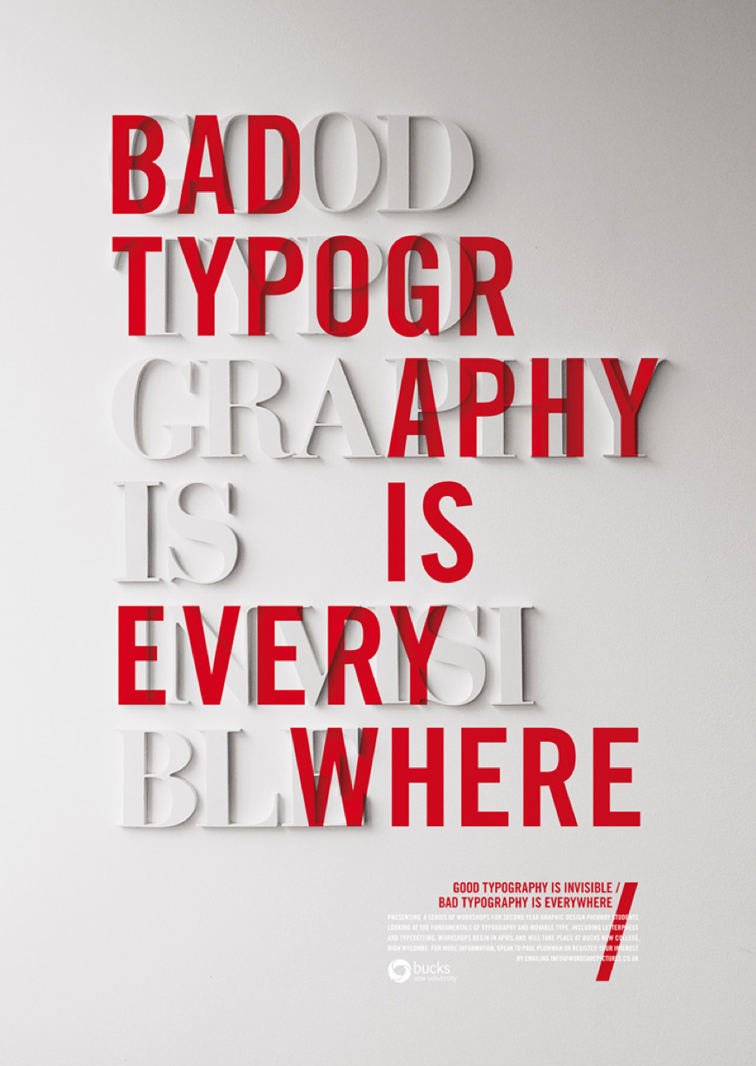
This piece was created by award-winning, London-based design director, Craig Ward. Ward has designed advertisements for Calvin Klein, Starbucks, Macy’s, Peugeot, Dior, and MasterCard to name a few. I was searching for advertisements for this post on Pinterest, and came across this image from Ward: https://theultralinx.com/2014/06/30-stunning-typographic-posters/. I couldn’t find the original site where this design was first posted, but I found out what it was created for. This advertisement was created for Buckinghamshire New University to advertise to second year graphic design students about the fundamentals of typography and how to use it properly. You can check out more of Ward’s work on his website here: http://wordsarepictures.co.uk/
San Serif Type
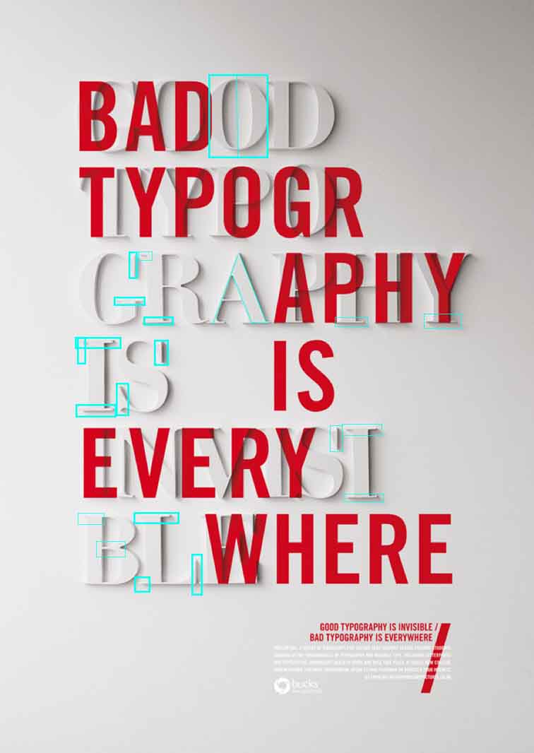
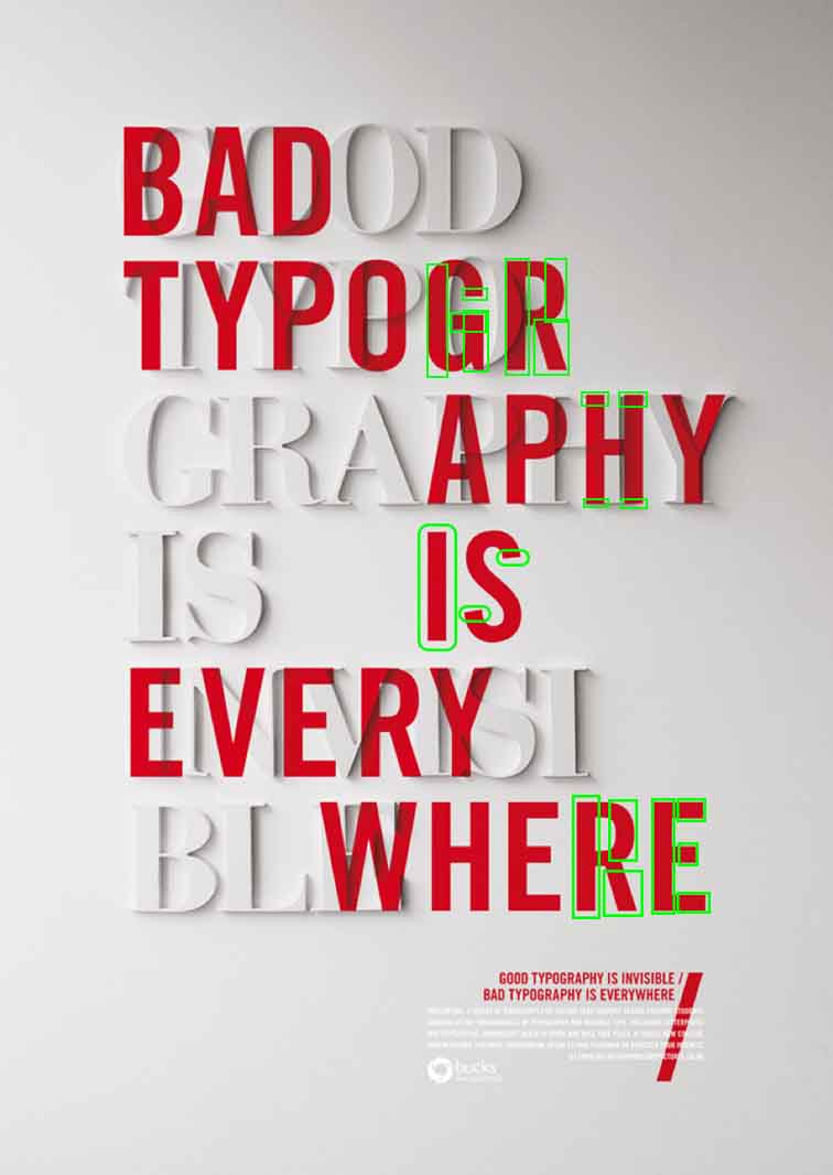
The first font used in this design is of the San Serif Typeface collection. The characteristics of this font that make is San Serif is the lack of serifs. On this draw over, I pointed out the lack of serifs on the S and H. There isn’t the transition of thick to thin or thin to thick in the strokes, as pointed out in the G, R’s, E, and I. There also isn’t any stress on the letter in the type since there isn’t the thick/thin transition.
Modern Type

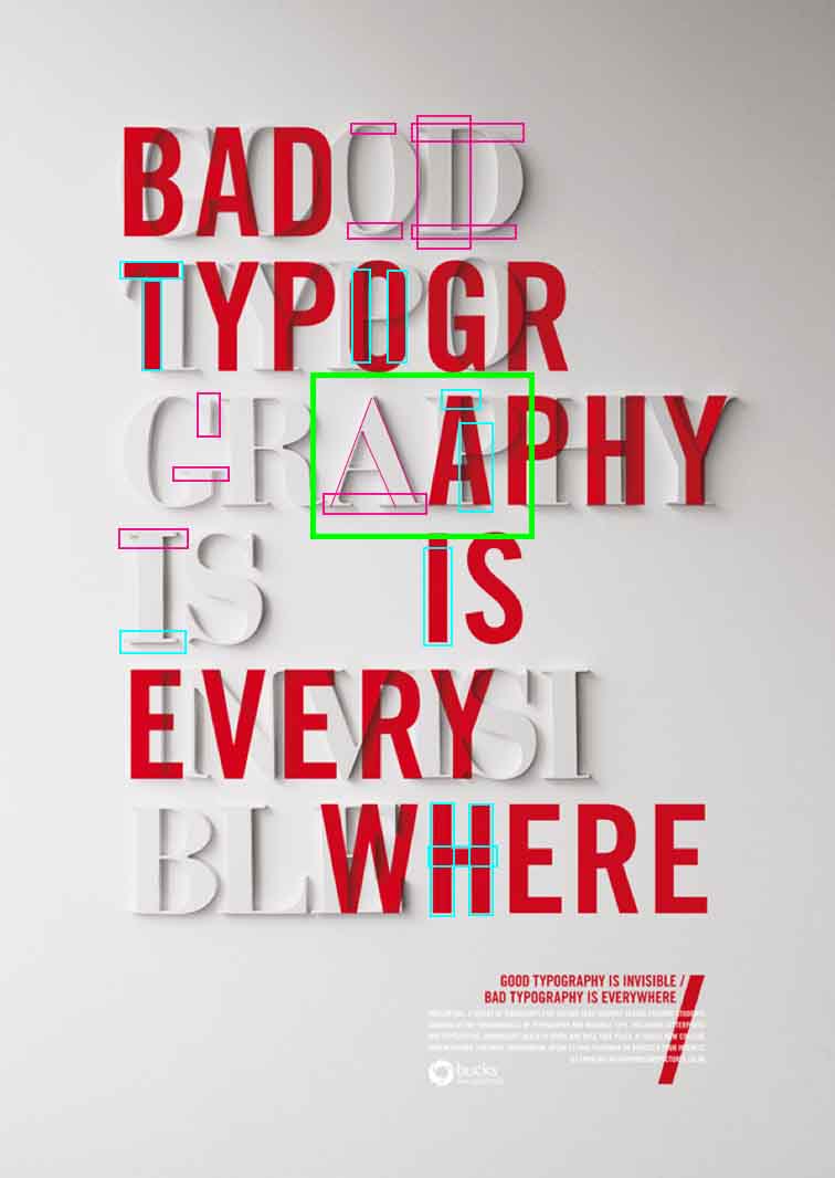
The second font used in this design is of the Modern Typeface collection. The characteristics of the Modern Typeface is the use of serifs. In this design, the letters are uppercase, and feature serif’s on most of the letters. Another characteristic of the modern typeface is the vertical stress on the letters, as you can see on the letter O at the top. The Modern Typeface also uses the thick/thin transition, as you can see on the A in the middle of the text, and in the middle of the B in the last line of the white text.
Contrasting Elements

The Modern and San Serif Typefaces contrast each other in several different ways. The Modern Typeface characteristics are shown in hot pink in the design above. Modern uses horizontal serifs, radical thick/thin transition strokes, vertical stress in the font. San Serif has a lack of serifs, no stress, and not thick/thin transition strokes. Not to mention the Modern Typeface is white against a white background while the San Serif Typeface is a bright red placed over the white Modern Typeface.
Conclusion
This design uses “good” typography against “bad” typography. Craig Ward uses the two Typefaces against each other to show how to use typography correctly. “Bad typography is everywhere” suggests that people tend to recognize and use bad typography more often than good typography. “Good typography is invisible” tells us that people don’t usually good typography. The bold red “bad” typography catches our attention before we can see whats hidden underneath, an aesthetically pleasing use of “good” typography. Ward shows us how two typefaces, neither one better than the other, can affect a design in a negative or positive way.


