Join below for the greatest social media newsletter ever. Ever Ever.👇
Thank you! Your submission has been received!
Oops! Something went wrong while submitting the form.
X
.svg)

Social media icons are a vital part of your marketing strategy.
You need icons to promote your social channels at touchpoints like your website, blog, email campaigns, and even IRL places like business cards.
But if you’re thinking of throwing a chic spin into Twitter’s logo so it matches your brand’s aesthetic, you might want to rethink that idea.
Social media platforms take their branding seriously. Most importantly, they invest a ton of money into enforcing trademark violations against and misuse of their logo.
Creating your own icons isn’t completely off-limits. You just need to understand each platform’s unique guidelines.
We also included a handful of safe and attention-grabbing icon sets you can download and use right away.
Bear in mind, none of the following qualifies as legal advice. It’s for informational purposes only.
Social media websites don’t sell physical products or services. Their entire livelihood is built around the app’s features and the branding associated with it.
Branding – specifically that of logos and colours – is absolutely essential for each social media company. Their logo defines who and what they are.
Do you remember what Twitter looked like back in 2006? Or should I say Twttr.

Aside from the edgy graffiti font and “whats in yr head,” the logo alone makes a statement about who and what the app is for: It’s trendy, casual, and quick.
Clearly, Twitter has gone through some rebranding over the years. Today, you can’t even hear the word “Twitter” without that iconic blue bird immediately coming to mind – and that’s the whole point.
Just think about how we use social media. We don’t scroll through a list of app names on our phones. We tap minimalist social media icons from our app screen.
What I’m trying to say is, social media brands – like all brands – take their logos seriously. Each logo is copyrighted, often in multiple countries, and applicable under relevant trademark laws.
And as some of the wealthiest companies in the world, these social media companies have the resources to find and respond to misuse of their logo.
Sure, you might not get hit with a court summons or fine right away. A cease and desist is more likely to come first – but why take your chances?
You really don’t need to wing it when designing social media icons because each brand lays out specific guidelines very publicly.
Twitter, Facebook, Instagram – all these brands want you to use their logo and even put your own spin on it within reason.
They just want to ensure your creation reflects their logo as they intended. That’s why each brand has its own rules.
Remember, Facebook and Messenger are technically two different apps, so Facebook has unique guidelines for each. According to Facebook, using any kind of logo you found online isn’t appropriate unless it comes directly from the Facebook asset pack.
Here are the general rules as they apply to the trademark F:

Instagram calls its icon the “glyph” and it prefers you use this basic icon over the colourful app icon.
According to Instagram, you should use a black and white glyph outline to promote your business. Only use the colourful app icon if you’re encouraging someone to download the app.
Like most social media brands, YouTube has rules both about how you use the logo itself and how you mention the brand’s name within a sentence.

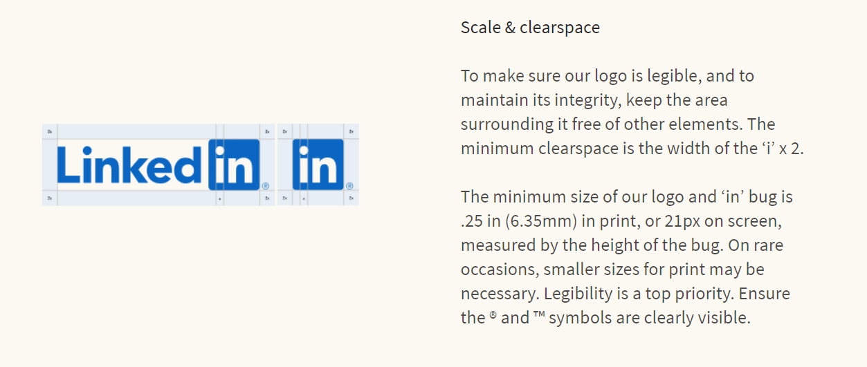
LinkedIn offers convenient asset packs in both English and Chinese to ensure their logo and icons are used properly across the web.
The professional social media platform also has specifically strict rules as to its whitespace surrounding various pieces of its logo. Instead of paraphrasing and getting something wrong, it’s easier to just post its screenshot here:
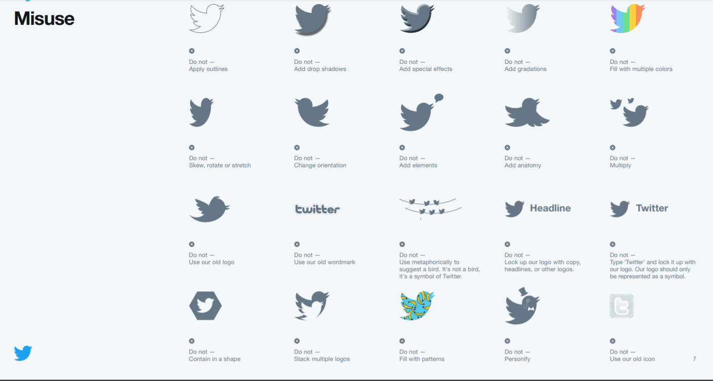
Respect the bird! Don’t alter the bird! Twitter has a somewhat different logo compared to most social media companies, so its brand guidelines on proper logo use are pretty extensive.
Here’s a summary of rules about the bird alone:

Like other social media companies, Twitter doesn’t want you to distort its icon or change the colours. However, keep these important factors in mind as well, as they are related to the bird specifically.
Twitter also has a ton of misuse examples. I guess the bird just begs to be altered.
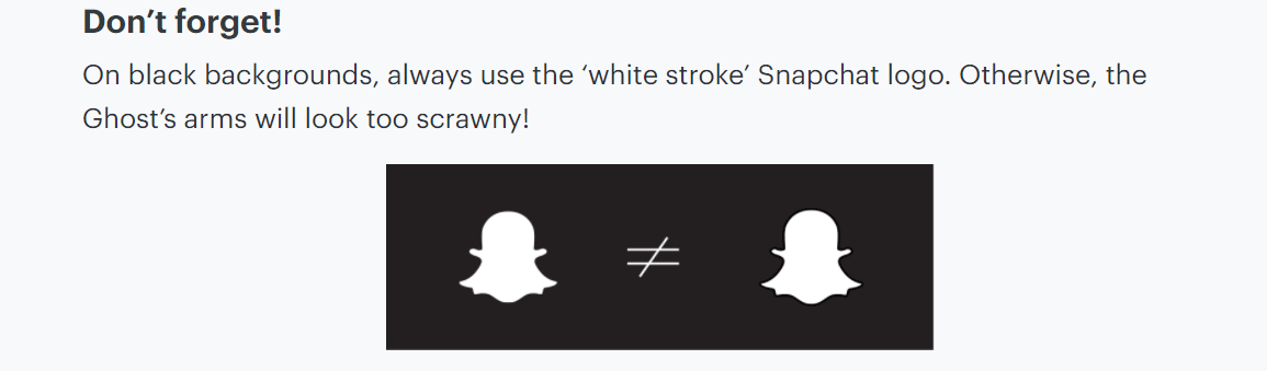
According to Snapchat, the ghost logo represents the true spirit and personality of the brand. Specifically: simplicity, spontaneity, and a blank canvas.
Snapchat also says the ghost’s charm lies in its simplicity. That’s why they don’t want you to colourise or animate the ghost unless you’ve contacted them for permission.
The social media app also has a clear request for using its ghost against a black background. The “white stroke” logo as Snapchat calls it is important to keep the proportions correct:
At this point, TikTok doesn’t appear to have a public set of brand asset guidelines.
Since we can’t find anything specific right now, let’s look at the general TikTok logo and make some conclusions:
We could reasonably assume that:
Pretty much any stock photo website that offers vector graphics will have plenty of downloadable social media icons for every site you could possibly need.
Keep in mind, these stock photo sites might not have the time and resources to verify that every icon set abides by the respective brand’s logo guidelines. In many cases, the stock site might not even know there’s an issue until Twitter or Facebook contacts them for removal.
Some vector sites or user-generated sites with unique social media icons include:
Please use these at your own risk in your marketing materials or as inspiration to create your own social media icons.
Always reference the guidelines above via the links for the latest updates to proper logo usage and misuse. Have fun!
Anyone can create their own social media icons. If you have design experience, give it a shot yourself so you have something totally unique to your brand. Remember, your social icons will go on every piece of marketing you send, so try to keep them consistent.

I've got experience with brands, both in agency and in-house. I specialize in researching brands, audiences, industries, cultural trends, competitors' positioning, and finding insights.
These might interest you...
why should I sign up for the newsletter?


