Shell and user interface
Desktop
Once up and running, after briefly admiring the new startup logo, you're presented with probably the ugliest default wallpaper of any current OS; even the fecal brown of Ubuntu is more aesthetically pleasing. The Windows 7 betas had an amusing fish as their wallpaper (a betta fish; betta, beta, geddit?). The fish has unfortunately had his chips and is gone, replaced by a frankly gross Windows logo overlaid with silhouettes of trees, butterflies, and random dots. The styling is inconsistent with the visual cues in the rest of the operating system (it doesn't follow from the theming of either the new startup screen or the logo on the Start orb, or anywhere else that the logo is used), it's inconsistent with the Aero Glass appearance that 7 inherits from Vista. And, most importantly, it's just irredeemably ugly and horrid.
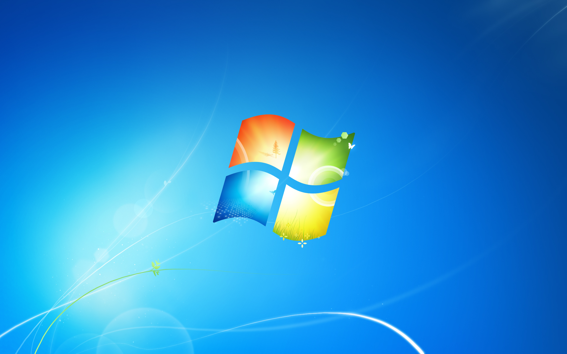
This is a pity, because some of the other wallpapers provided with Windows 7 are very nice indeed. 7 has a handful of new themes that include some nice photographs and fun artwork. As with Vista, users in some countries will also have a custom country-specific theme showing landmarks and vistas belonging to their nation. I'm sure some focus group or designer somewhere will justify the default wallpaper and explain how wonderful it is, but I couldn't stand to look at it and I think it falls a long way short of the standard set by the other themes. Architecture is my favorite.
Once the hideousness of the wallpaper has been overcome, careful observers might notice that Vista's Sidebar has disappeared, but its Gadgets remain. Gadgets now float above any desktop icons, below all windows. I think this is a better place for them (they no longer impinge on the usable area of the screen, which I appreciate on my laptop), but I still don't find myself using them to any great extent. I have a weather widget that's handy, but none of the other bundled ones inspire me, and though there are now a few hundred to download, there are few that strike me as particularly compelling. There are things I would like to have as Gadgets (a nice Twitter reader, for example), but the overall selection is poor. This isn't helped by poor support from Microsoft; there are a couple of Outlook gadgets out there to do things like show upcoming appointments, but honestly, these things should ship with Office, not as separate downloads. Promote the technology, don't just let it languish, unloved.
I can at least now add Gadgets without worrying about running out of memory. The memory footprint of Gadgets in Vista was awful; different Gadgets ran in different processes, and as best I could tell they leaked memory like a sieve. That no longer appears to be the case.
Appearance
Windows 7 will look familiar to Vista users; it retains the Aero Glass theme with its translucent, textured window borders. There are some minor modifications, as the window borders and taskbar no longer go opaque when you maximize a window, but overall the new OS looks very much like the old one, and things that are bad in Vista (the minimal differentiation between active and inactive windows, ugly menu bars) are bad in Windows 7. I am disappointed with just how familiar the appearance is, in fact. Vista has a lot of visual inconsistencies, both due to a failure to follow new UI guidelines and a failure to pay attention, and many of these are retained in Windows 7. It makes the OS look very sloppy; there is a great lack of attention to detail, suggesting that Redmond doesn't really care about how it looks.
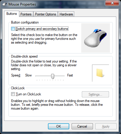
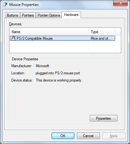
Some of these inconsistencies are broad in scope. Control Panel has a new style of applet that loads up within the Control Panel window rather than in a pop-up dialog box. The new style looks better and is more flexible (it can be resized, for example), but many applets use the old style, meaning that you're never quite sure what will happen when you pick an applet. Sometimes a new window will pop open, sometimes it won't. This was perhaps excusable in Vista, as a transitional OS bridging the old with the new, but the same situation exists in 7. Many built-in applets (for example, the mouse control panel) are still stuck in the old style.
The mouse control panel is doubly bad, because not only is it still an ugly dialog box, it also reverts to battleship grey! Battleship grey should be dead and buried, but a quick peek at the Hardware tab reveals it in all its glory. And doesn't it look splendid? The new, themed white tab with ugly battleship grey contents. It's even more jarring because the border around the content area is still themed and white, leaving a strange white line down the left-hand side of the window.
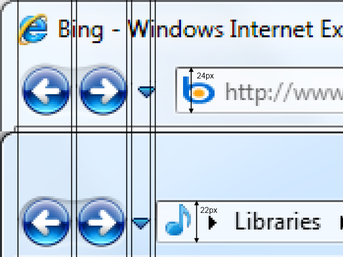
And OK, it's being picky, but why oh why do Explorer and Internet Explorer look different? They are meant to look the same. An attempt has clearly been made to give them the same styling and appearance. Yet they're gratuitously different. Not terribly different, but different all the same. The spacings are different, and the address bars are different heights. It's just haphazard and random. The widgets have been plopped down onto a window and someone's just said "yeah, that looks close enough", even though it's wrong. Fit and finish matters. As the new UI guidelines say: Pay attention to detail, and make sure everything is polished. Don't assume that users won't notice small things. They will.
reader comments
487